
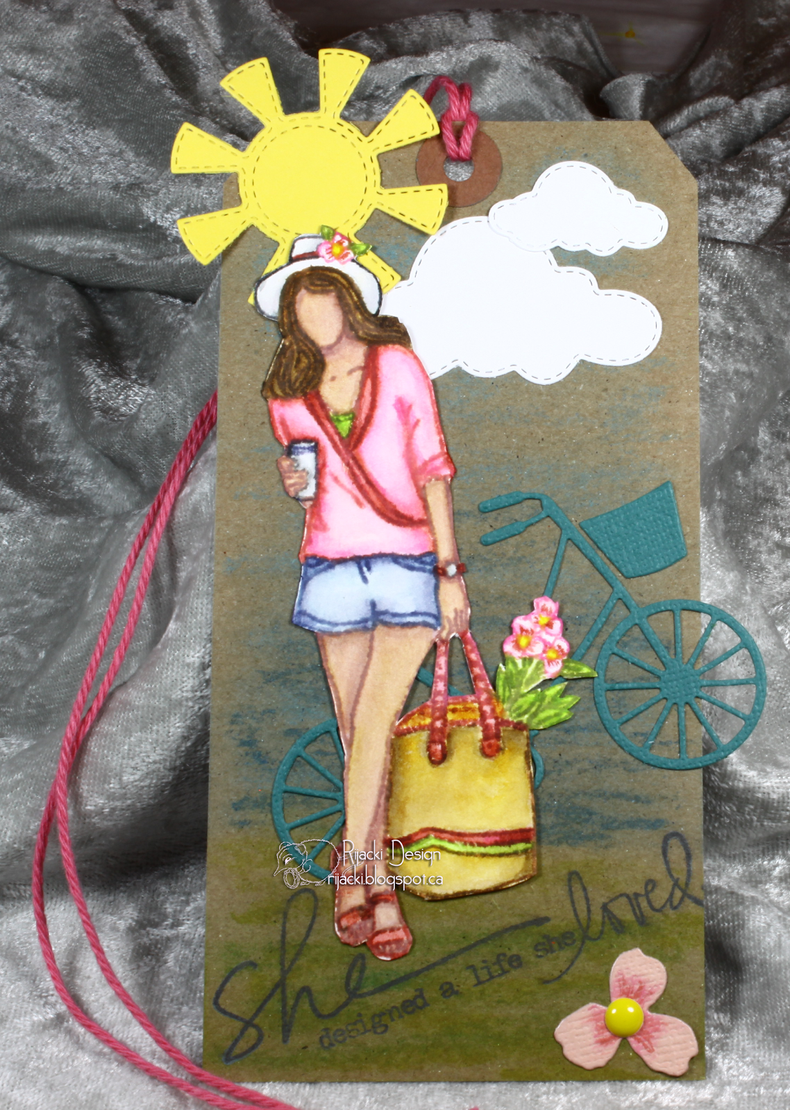
While at work on Monday, an idea started building in my head. I wanted to use a "She" sentiment and decided I wanted to use the Angie Girl from the grab bag I got a few months ago for a Springy tag. I remembered I had a bicycle die and thought it would be great with the shopping bag of the girl, a nice shopping excursion scene.
Supplies


For this blog post, I decided to show how I do the painting, what colours get added on. Lots of pictures. At the top of the image is my notes on the colours I put down on my palette and plan to use in an area.

After dinner, I started laying out my tag, using the stamps and dies in a rough dry fit. The stamps are mirror image so their placement has to be flipped mentally. I saw it would all fit so, off I went.
I use Distress Inks, mini pads smushed on a plastic divider, with waterbrush to paint the image. I find waterbrushes are much easier than traditional brushes and I don't have a wash water to get all gunky. I use wet wipes to wipe the brush in between colours and do have a small pan of water on hand to lightly tap the brush tip (instead of squeezing the reservoir) to add a small bit of damp without wetting down the brush too much. If the brush is getting too watery, I use a dry wet wipe on the brush to sop up water from the bristles. I generally paint wet on dry. I leave the card dry and apply the ink with the slightly wet brush. Aside from the vibrant colours, the reason I like using Distress Ink for my colouring in this way is that the ink is already wet. It doesn't need a lot of wet to use it with the waterbrush so I can use marker-ish techniques as well as watercolour ones.

I started by stamping the image with pink on 80lb watercolour cardstock. The lightweight card is consided "student grade" but I find it perfect for stamping. I generally use Canson or Strathmore. I can get the Canson at Micheals by home but have to go to the US, to Jo-Anns, to pick up the Strathmore at this weight.

I started with a light olive, Old Paper, for the base of the skin.

Victorian Velvet for the skin shadows.

I added a light wash of Tea Dye over all for a tan. Better than the tan in a can ;-)

Then Tattered Rose to the sin and I started on the hair and bag with Tea Dye.

I used Gathered Twigs for the hair shadows, Vintage Photo for the hair colour, and Ground Espresso for the deeper shadows. I started on her blouse, Spun Sugar for the base and Fired Brick for the shadowing.

I added Picked Raspberry to the blouse and more Fired Brick with a bit of Aged Mahogany for deeper shadows.
You might not guess this, but I never really was a fan of pink or other pastels until I started making jewelry a few years ago and then papercrafting. I was blond as a child, I got dressed in pastels whether I liked it or not. I prefer darker or more vibrant colours.

I added Twisted Citron for the peek of the camisole and Fired Brick for her sandals. I also started the leaves with Twisted Citron. I love that bright, almost neon, Spring green of Twisted Citron. I'm a bit frustrated, though, that the tins for the mini pads fit all the greens except one. I have my tins by colour groups and Twisted Citron is on its own in a tin of other colours. So many greens! and I love each one for its own reasons. *laugh* I added shadowing on the bag with Vintage Photo and Gathered Twigs and then more vibrancy with Wild Honey. I used Fired Brick and Twisted Citron for the strips with Aged Mahogany and Peeled Paint for the shadowing. I used Peeled Paint for shadowing on the camisole and Aged Mahogany on the sandals, too. I added Aged Mahogany for her watch band.

For her shorts, I started with Tumbled Glass and then added shading with Faded Jeans and Chipped Sapphire. The flowers are Spun Sugar with Picked Raspberry and Fired Brick. I decided to leave her hat white and so shaded it with Weathered Wood and outlined with Black Soot. I think Black Soot is the only one of the Distress line to have a standard colour name as part of its name. I added a small line of Fired Brick for the hat band and used Chipped Sapphire for the band on the cup. The cup I shaded with Weathered Wood and lined with Black Soot, like the hat. I added a light wash of Fired Brick to the bag handles and shading with Aged Mahogany. The watch face is Weathered Wood. The flower centres are Mustard Seed.

This is what the palette ends up looking like. I wipe it all away with a wet wipe for the next project. I kinda group colours, but it does get more jumbled as I go along with smushes just going where I have space. If I know I will need a lot of a colour, I will smush more. If I know it will only need a tiny bit, I just tap the mini pad to the palette. If I want to mix two colours before using them, which I didn't for this project, I will drag their edges together leaving one side of the square 'pure'and the other mixed. I love the versatility of this method. Every palette ends up a bit different depending on the project.

I fussy cut the image using a craft knife for the inside areas around the bag handle.

For the background on the craft tag, I used Gelatos. I don't have the Distress Oxides yet and regular Distress doesn't really work well on craft. For the Gelatos, I smeared the crayon on the tag and then, with a dry wet wipe, I blended the crayon over the surface. These craft tags do not hold up to much water at all, another reason I didn't want to use my beloved Distress Inks. I have an extremely limited number of Distress Crayons (just one pack) or I might have used those.

At this point, it felt like it was missing something. I wanted something in that lower right corner but didn't know what and nothing in my stash was singing to me. But, it was midnight (and my 'bedtime' is 11) so I had to leave it.

As I was starting to wake up, I thought about other dies I have and pondered if the cherry die (Elizabeth Craft Designs) had a 3 petal flower like the ones in the Unity image. Ah-ha! It does. I die cut it from a scrap of the Core'dinations and added colour to match the girl's flowers with Picked Raspberry and Fired Brick. I added a yellow centre with a shallow domed enamel dot, the highest dimension on the whole tag. I also added the basket from the bicycle dye and finished with Strawberry Slush baker's twine. I was so jazzed about this tag, I wrote this up in the morning while eating breakfast before my day job instead of reading Facebook *laugh* So glad I don't have a set start time at work.

Challenges
Unity {Show and Tell} FB group: Spring Tag
Des R Us: Tag
Creative Craft Cottage: Dies
Simon Says Stamp Wednesday challenge: Spring Colour
Simon Says Stamp Work-It-Wednesday: Spring
Crafter's Cafe: Spring
Just for Fun: Photo Inspiration (Spring images)
Crafty Gals Corner: Pastels
Your tag has all the best things about spring, Rijacki! I had a little mini-vacation just looking at it - thanks for playing along with us at the Simon Says Stamp Wednesday challenge!
ReplyDeleteGreat to see how you've made this. Love this. Thanks for joining us at Creative Craft Cottage. Good luck.
ReplyDeleteBye, Groetjes van Ine (DT)
http://creaine-cards.blogspot.nl/
I love that you shared your coloring process! What a great tag! I'm so glad you shared your artwork with us at JFF Stamps! Good luck! Wendy DT
ReplyDeleteMy goodness, that is just stunning, beautiful card.
ReplyDeleteWhat a fabulous idea ... looks awesome! Beautiful coloring! Thanks so much for playing in our ‘Tags’ challenge at Dies R Us! Please come back again soon!
ReplyDeleteDarlene (DRU Blog Leader)
DIES R US CHALLENGE BLOG
DAR’S CRAFTY CREATIONS Please come for a visit.
I just love your tag. Great coloring and a wonderful scene! Thanks for joining the Just For Fun challenge. We hope to see you back again soon.
ReplyDeleteBeautiful tag that tells a story. The sentiment is perfect.Thanks for sharing it with us at Dies R Us Challenge Blog. We hope we will see your designs in future challenges.
ReplyDeleteKathy
DRU DT
What a fun tag that you can see you put a lot of creativeness into it..love it! Thank you for joining our challenge at Dies R Us!
ReplyDeleteDiane DRU DT {Nellies Nest}